Single-cell RNA sequencing (scRNA-Seq) is a powerful tool for uncovering cellular heterogeneity within organs and tissues, which is difficult to achieve using bulk RNA sequencing. A widely used analysis toolkit for scRNA-Seq is Seurat in R. Below, I outline the workflow used in this study.
In this article, I analyzed scRNA-Seq data from 1,278 mouse pancreatic cells and identified marker genes specific to each exocrine and endocrine cell cluster. These included rare pancreatic polypeptide (PP) cells, pancreatic stellate (PS) cells, endothelial cells, and MHC class II antigen-presenting cells. Additionally, the analysis revealed subpopulations of \(\alpha\), \(\beta\), \(\delta\), acinar, and ductal cells. This workflow can be adapted to other datasets for studying cellular heterogeneity.
The pancreas plays a crucial role in both the digestive and endocrine systems. The exocrine pancreas primarily consists of acinar and ductal cells, responsible for enzyme synthesis and transport, respectively. The endocrine pancreas, known as the islets of Langerhans, is composed mainly of \(\alpha\), \(\beta\), PP, \(\delta\), and \(\epsilon\) cells, which secrete glucagon, insulin, pancreatic polypeptide (PP), somatostatin, and ghrelin, respectively. Notably, cellular heterogeneity within the pancreas, especially within the islets of Langerhans, has significant functional implications.
Import Some Useful Packages.
1
2
3
4
5
6
| library(Seurat)
library(patchwork)
library(Matrix)
library(hdf5r)
library(stringr)
library(dplyr)
|
Import Datasets
1
2
3
4
| setwd() #Change to your working directory
data<-read.csv("Pancreas-counts.csv",row.names= 1)
annotation<-read.csv("pancreas_annotations_FACS.csv")
metadata<-read.csv("pancreas_FACS_metadata.csv")
|
The annotation chart may need to be reshaped, please refer to the documentation of Seurat.
Pretreatment
Filter ERCC
1
2
3
4
| erccs = grep('^ERCC-', x= rownames(x=data),value = T)
percent.ercc = Matrix::colSums(data[erccs, ])/Matrix::colSums(data)
ercc.index = grep(pattern = "^ERCC-", x = rownames(x = data), value = FALSE)
data = data[-ercc.index,]
|
For mitochondrial and ribosomal genomes, the operations are similar.
Create Seurat Objects
1
| data = CreateSeuratObject(counts = data, project = "data", min.cells = 3, min.features = 200)
|
Quality Control
1
2
3
4
5
6
7
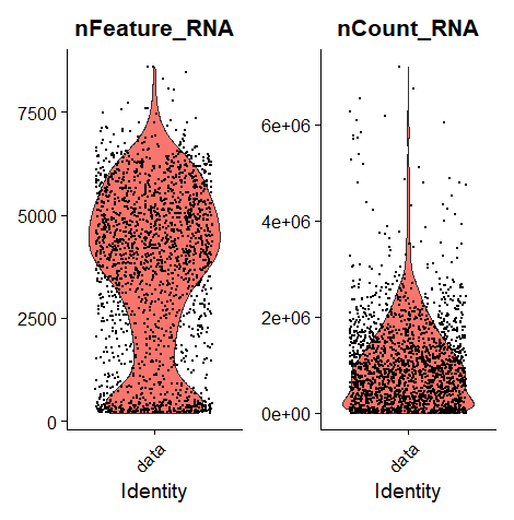
| VlnPlot(data, features = c("nFeature_RNA", "nCount_RNA", "percent.mt"), ncol = 3)
summary(data[["nFeature_RNA"]])
summary(data[["nCount_RNA"]])
summary(data[["percent.mt"]])
plot1 = FeatureScatter(data, feature1 = "nCount_RNA", feature2 = "percent.mt")
plot2 = FeatureScatter(data, feature1 = "nCount_RNA", feature2 = "nFeature_RNA")
plot1 + plot2
|
There was no mitochondrial genome in my data set, so the parameters of the violin plot were somewhat different.
Seems nFeature_RNA is enriched in [200, 7500].
1
2
| data = subset(data, subset = nFeature_RNA > 200 & nFeature_RNA <7500 & percent.mt < 10)
dim(data)
|
Normalization
1
| data = NormalizeData(data, normalization.method = "LogNormalize", scale.factor = 10000)
|
Feature Selection
1
2
3
4
5
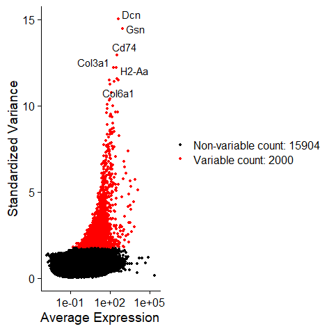
| data = FindVariableFeatures(data, selection.method = "vst", nfeatures = 2000)
top10 = head(VariableFeatures(data), 10)
plot1 = VariableFeaturePlot(data)
plot2 = LabelPoints(plot = plot1, points = top10, repel = TRUE)
plot2
|
Scale the Data
1
2
| all.genes = rownames(data)
data = ScaleData(data, features = all.genes)
|
1
2
3
4
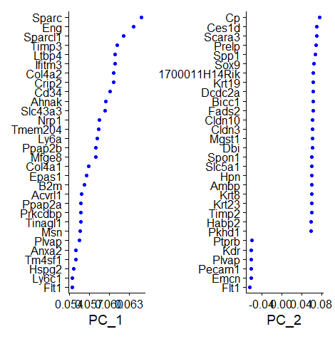
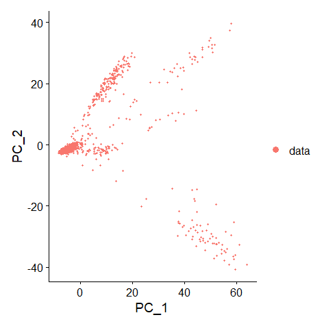
| data = RunPCA(data, features = VariableFeatures(object = data))
print(data[["pca"]], dims = 1:5, nfeatures = 5)
VizDimLoadings(data, dims = 1:2, reduction = "pca")
DimPlot(data, reduction = "pca")
|
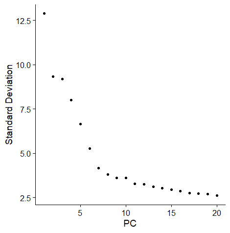
Determine the PC
11 clusters seems to be good.
Cluster the Cells
1
2
3
| data = FindNeighbors(data, dims = 1:11)
data = FindClusters(data)
head(Idents(data), 5)
|
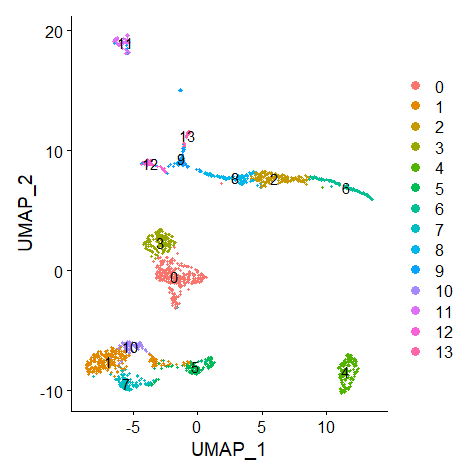
It returns me 14 clusters.
Run Non-linear Dimensional Reduction (UMAP)
1
2
| data = RunUMAP(data, dims = 1:14)
DimPlot(data, reduction = "umap", label = T)
|
Find the Markers
1
2
3
| markers <- FindAllMarkers(data, only.pos = TRUE, min.pct = 0.25, logfc.threshold = 0.25,test.use = "roc")
markers=markers %>% group_by(cluster) %>% top_n(n = 2, wt = avg_log2FC)
DT::datatable(markers)
|
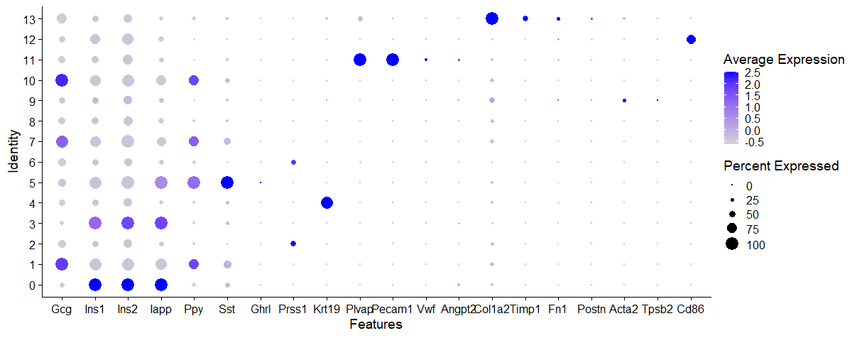
I think the dotplot below is useful if you are sure of the cell types that may be present in the sample. I have listed here the marker genes of pancreatic cells (both exocrine and endocrine).
1
| DotPlot(data, features = c("Gcg","Ins1","Ins2","Iapp","Ppy","Sst","Ghrl","Prss1","Krt19","Plvap","Pecam1","Vwf","Angpt2","Col1a2","Timp1","Fn1","Postn","Acta2","Tpsb2","Tpsd1","Tpsab1","Cd86"))
|
Rename the Clusters
1
2
3
4
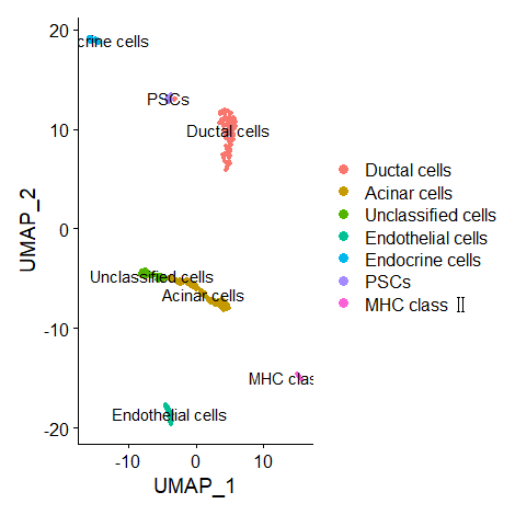
| cluster.ids <- c("Beta cells","Co-expression","Acinar cells","Beta cells","Ductal cells","Delta cells","Acinar cells","Co-expression","Unclassified cells","Unclassified cells","Co-expression","Endothelial cells","MHC class 2","PSCs")
names(cluster.ids) <- levels(data)
data <- RenameIdents(data, cluster.ids)
DimPlot(data, reduction = "umap", label = TRUE, pt.size = 1)
|
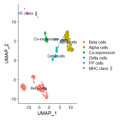
(Updated on 2021/11/16) There is a problem with the axis of original figure. Now that the data from exocrine and endocrine are separated… the results of UMAP are as follows.
Exocrine
Endocrine
What’s the next step?
The differences in physiological functions between the marker genes of different groups can be examined using online Gene Ontology (GO) enrichment analysis.
